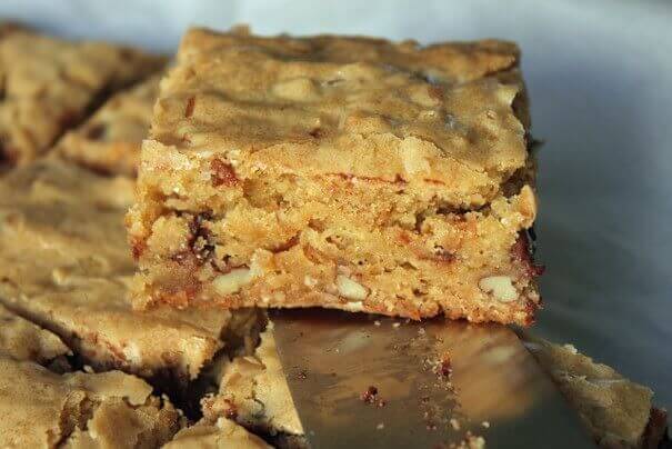
This is the bread-and-butter of the food blog industry, the kind of post 99% of food bloggers attempt when they start blogs. They buy fancy cameras, they set up fancy light equipment, and hope and pray that their beautiful version of blondies will bring them fame and fortune on the web.
Unfortunately, that’s not how it works. With so many food blog posts out there, your beautiful roast chicken is impossible to differentiate from the hundreds of other beautiful roast chickens that come up when you do a Google search. So the question becomes: how do you stand out?
My answer: style. Look at 101Cookbooks. Any time you go to Heidi’s blog, you know right away where you are on the web. No one else’s food blog looks like that and that’s the result of a carefully crafted design aesthetic, one that makes you feel like you’re visiting another world. And that’s key. The best food blogs (see also: Smitten Kitchen, Pioneer Woman, The Wednesday Chef) transport people away from their desks into another realm entirely.
You can achieve style with design (think font, graphics, banner, etc.); you can also achieve it with language. I think David Lebovitz is the perfect example of someone whose beautiful recipe posts are beautiful not only because of the pictures (which are great) but because of the words that surround those pictures. They’re totally his and his alone.
So if you want to get traffic the traditional way with the most typical of food blog posts, make sure you do it with style. Otherwise you’ll get lost in the shuffle.
Leave a Reply